05. [2021/22]
I Don’t See Color
Editorial Design
16x24cm
[Introduction]
Designers experience a constant desire to simplify and are indoctrinated to believe that less is more. If you’ve ever been taught design or even remotely shown any interest in it, surely this phrase is no secret to you. We’re (sub)consciously taught to simplify: use only a select amount of typefaces, sizes, and styles, embrace whitespace and make use of big margins.
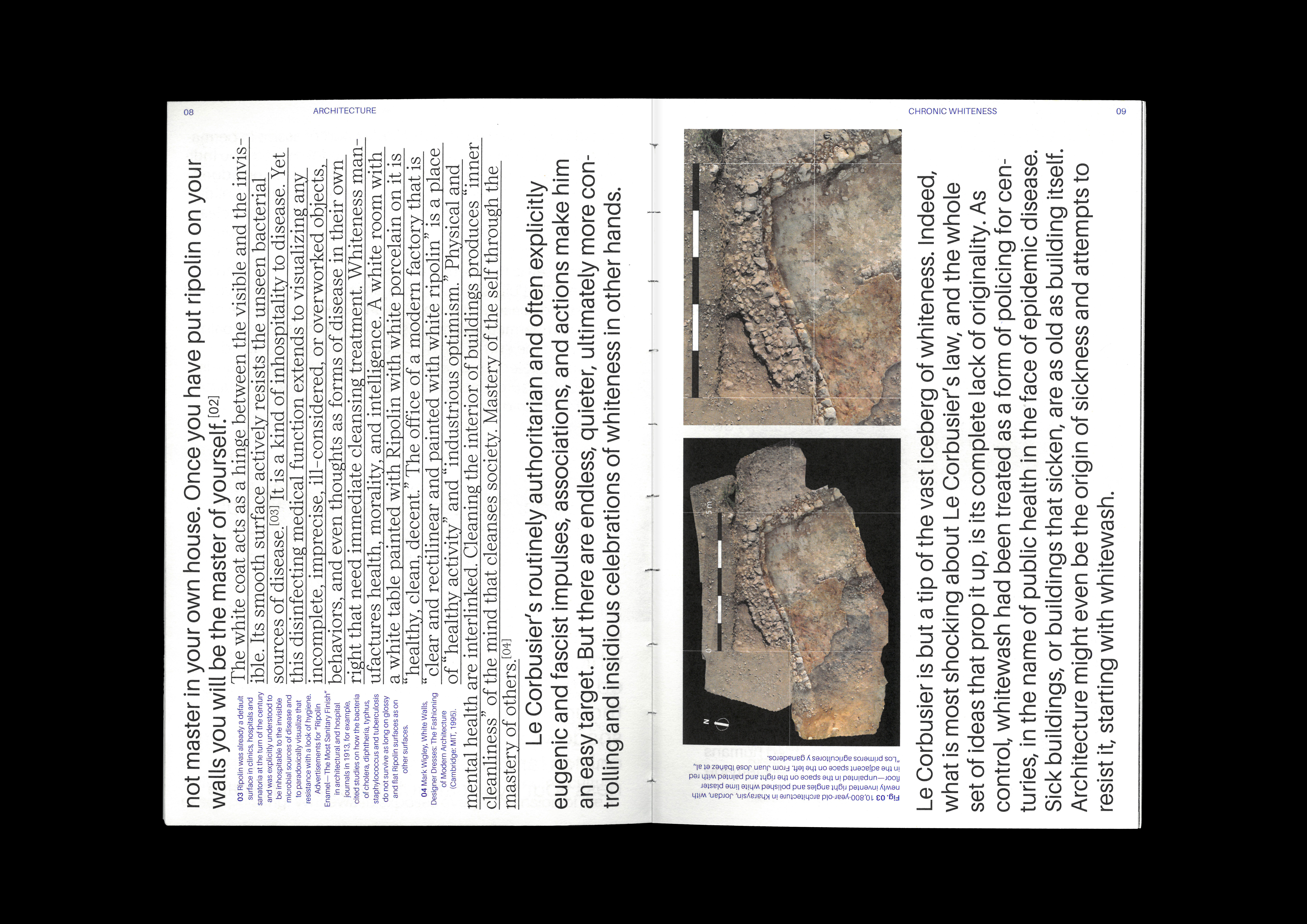
After digging deeper it came as no surprise that this phenomenon goes beyond the scope of graphic design and whiteness is actually continuously praised all around. From Le Corbusier’s Law of Ripolin to the whitewashing of ancient Greek sculptures, it’s clear that the eurocentric perception has had a big impact on the features we value when it comes to the arts.
I Don’t See Color investigates, critiques, and strives to inform about the effect of the eurocentric perception on different branches of art, such as sculpture, architecture, photography, fashion & graphic design. From the Law of Ripolin to the use of whitespace in graphic design and the whitewashing of ancient Greek sculptures, Whiteness gets praised everywhere. This book takes a stance against these rules and invites the reader to question their knowledge and look beyond whiteness.
Next Project
This publication is a collection of images depicting the different categories within the mask wearing community. The articles make it double as a source of information on the do’s and don’ts when it comes to wearing face masks.


